Home / Examples
Drag to compare. Same content, finished execution.
Every example is a real before-and-after rebuild. Pull the handle to reveal the polish, then see more recent jobs below.
Before / after wall
Pull the handle
The before and after use the same content. The only difference is the CSS.
 BeforeAfter
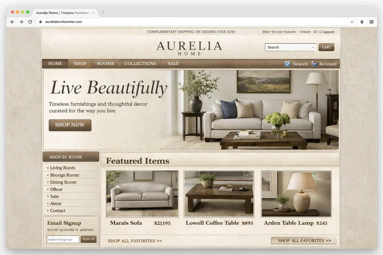
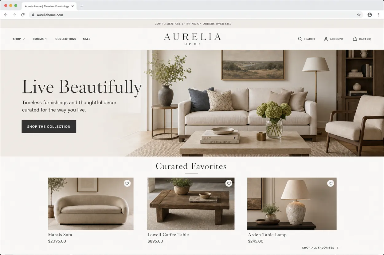
Harmony Home
An interior studio site. We aligned the grid, set a real spacing scale, and gave the call to action room to lead.
 BeforeAfter
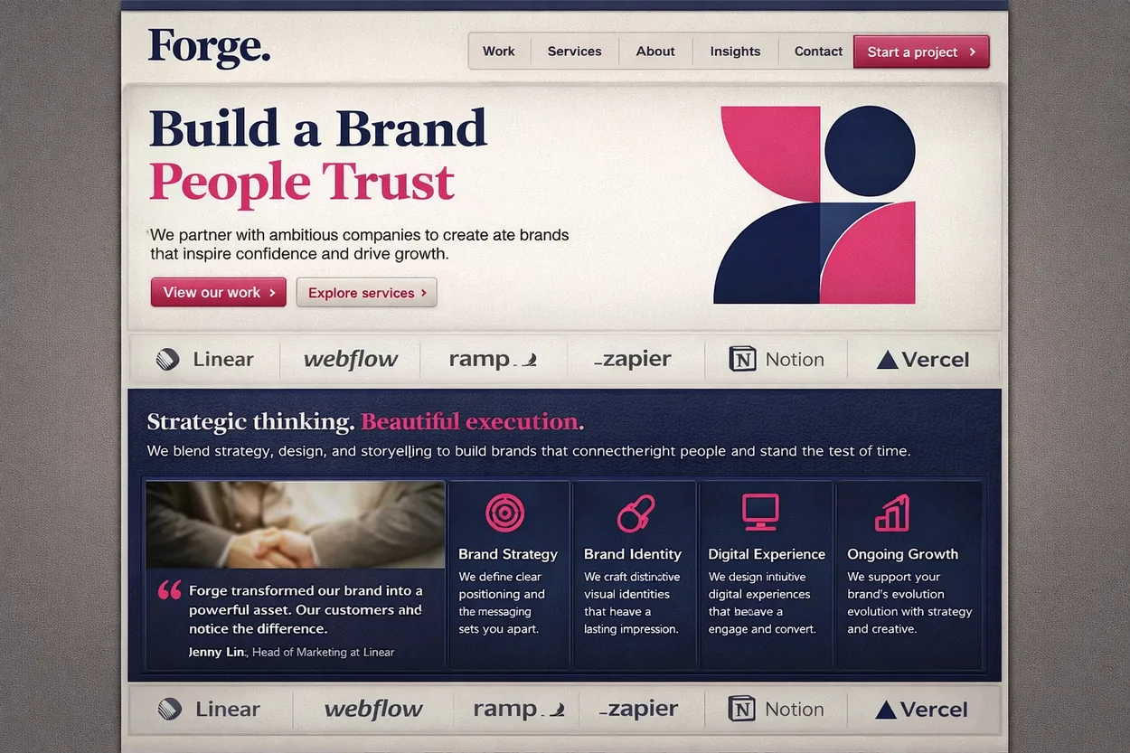
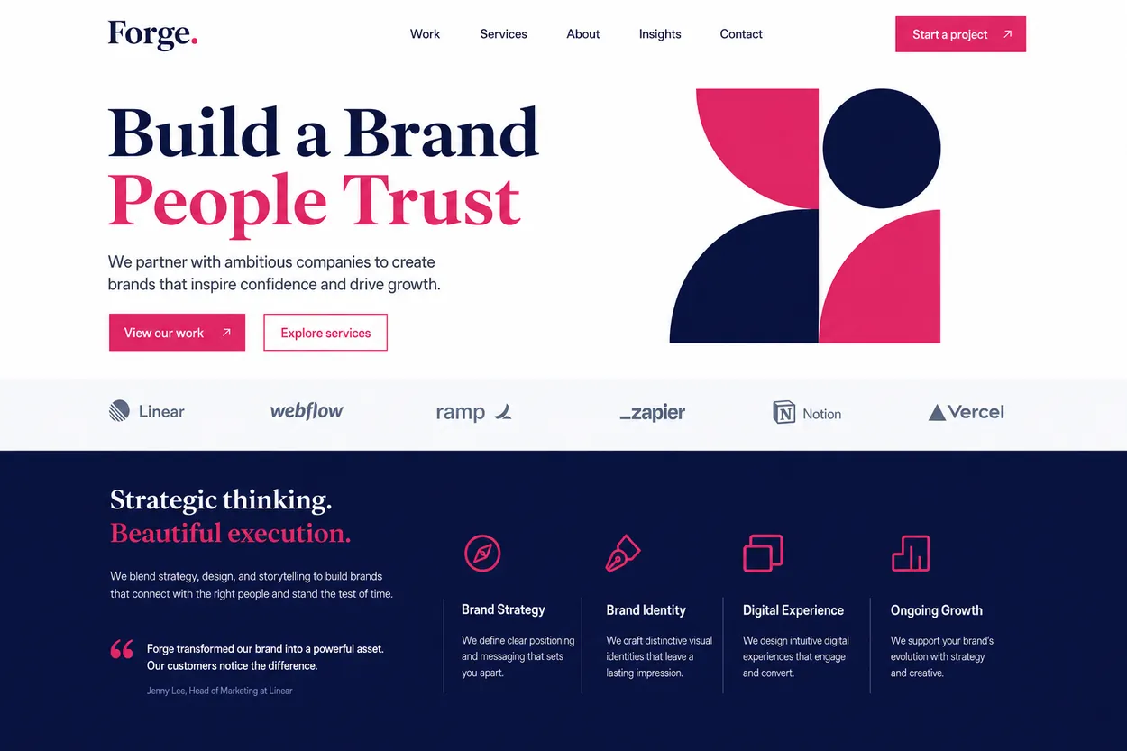
Brand agency
Flat, same-size text became a clear hierarchy. One weight scale did most of the work.
 BeforeAfter
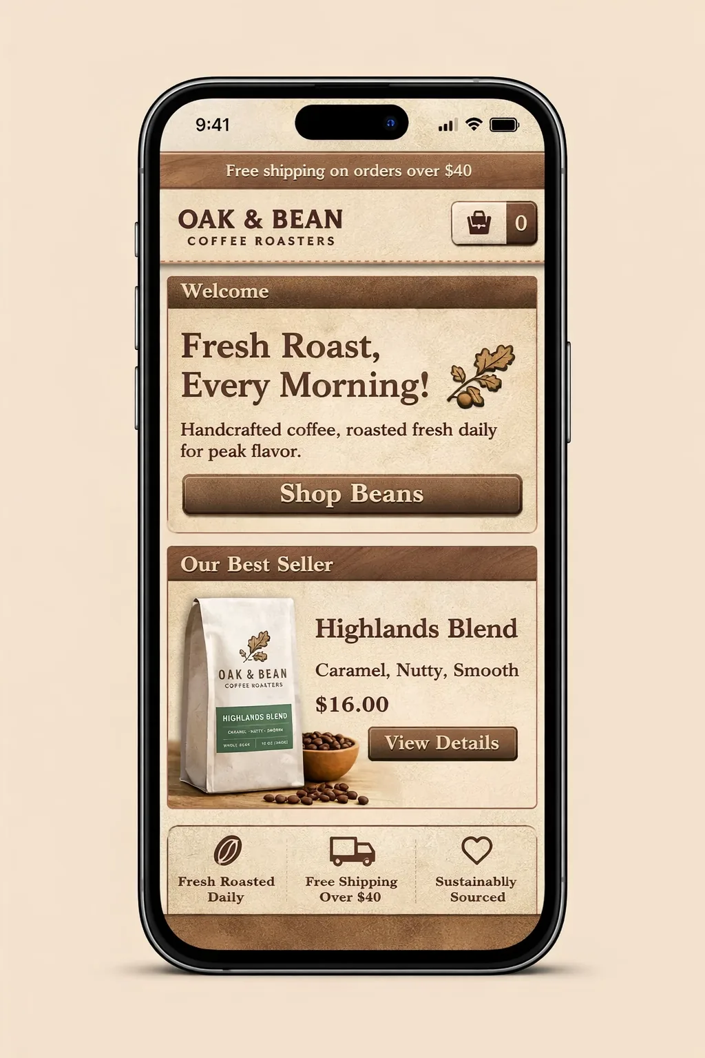
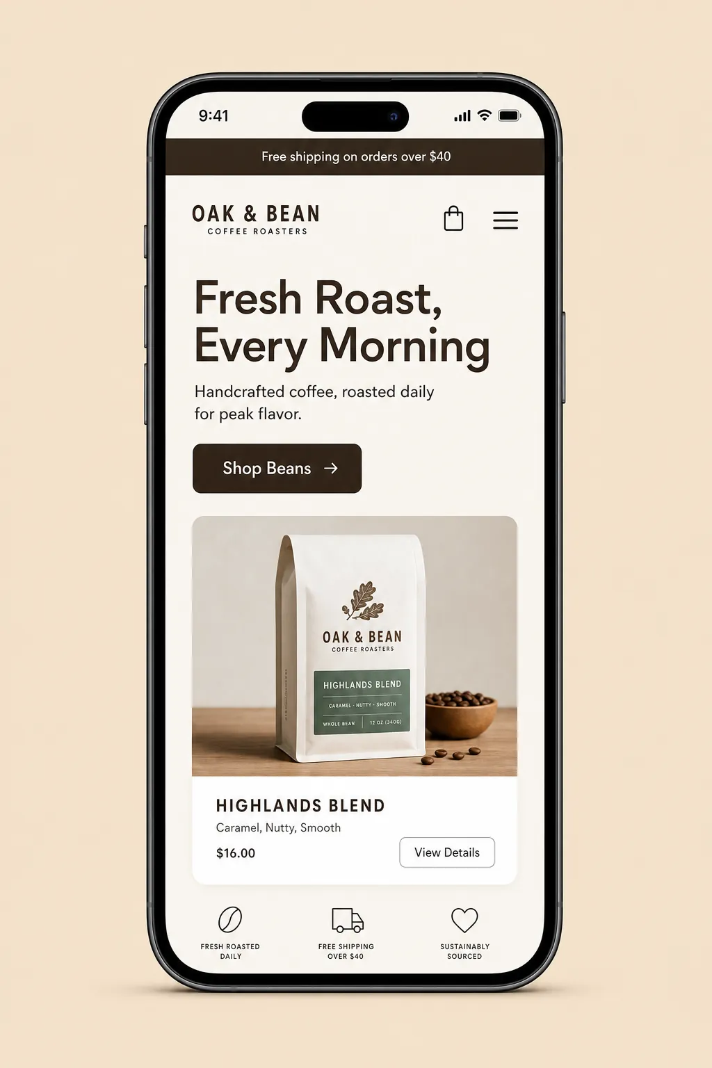
Coffee roaster
The desktop layout was being squished onto phones. We built a real mobile layout: no overflow, large tap targets.
 BeforeAfter
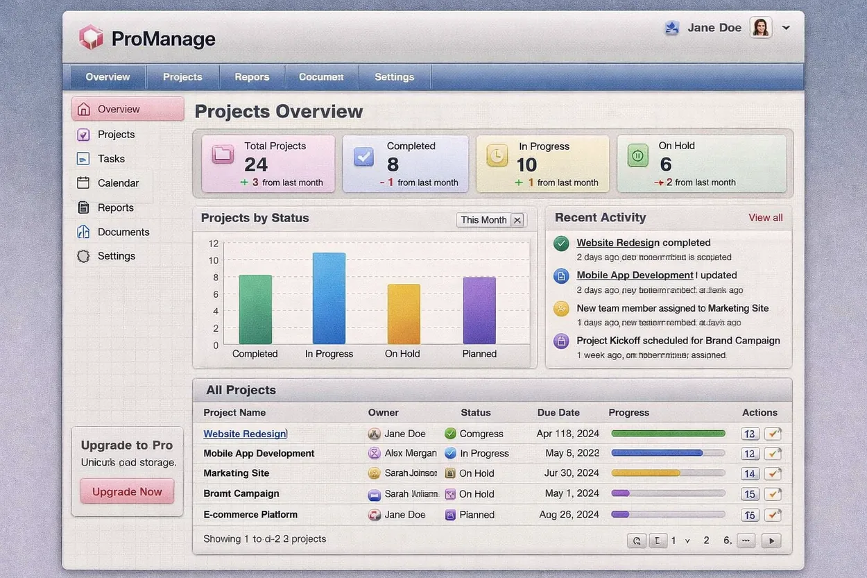
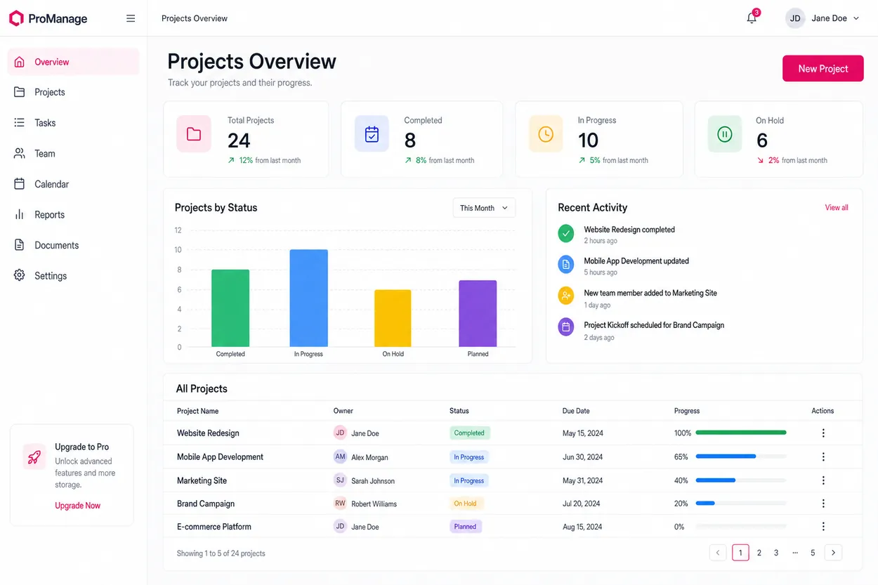
SaaS dashboard
A tangled, misaligned interface rebuilt on a consistent grid with readable, maintainable CSS.
Recent polish jobs
A few more sites we made look finished
Representative refinement work across industries.
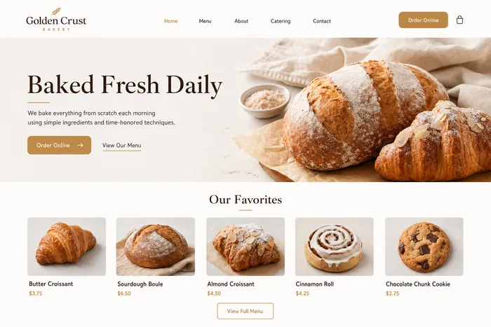
Baked Fresh Daily
Menu grid tightened, ordering CTA made the obvious next step.
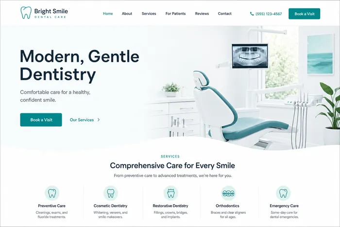
Gentle Dentistry
Calmer palette, AA contrast, and a single clear booking path.
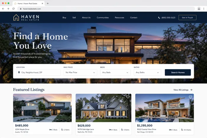
Find Your Next Home
Listing grid aligned, type hierarchy added, search made prominent.
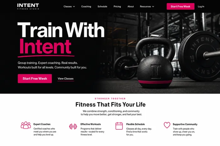
Train With Intent
High-energy without the clutter: spacing pass and a confident CTA.
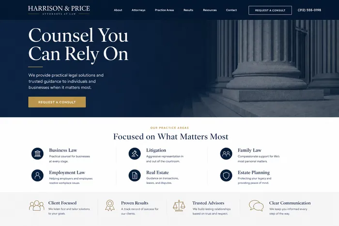
Counsel You Can Rely On
Serious, readable layout with a clean practice-area list.
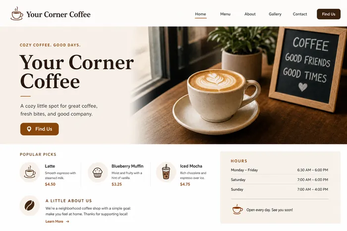
Your Corner Coffee
Hours and location surfaced, menu spaced to read at a glance.
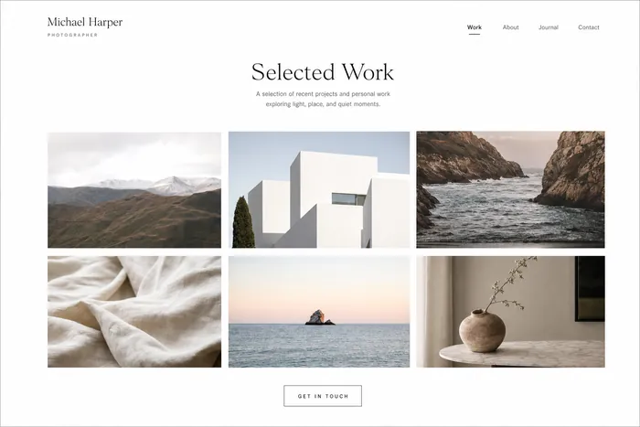
Selected Work
Editorial image grid with generous whitespace and refined type.
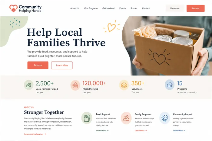
Help Families Thrive
Impact stats made scannable, donate path kept front and center.
See your site on this wall
Send a screenshot and get a free, marked-up review of what we would fix.